· 11 min read
How to make aesthetic notes that you actually study from
A practical system for aesthetic notes: three-colour palettes, four page layouts, a real type hierarchy, and the highlighting rule that keeps a pretty page useful.
Most advice about aesthetic notes is a photo of somebody else’s handwriting and no explanation. That is not a method, it is a mood board. This is the method — the small number of decisions that separate a page that looks good from a page that looks busy, and, crucially, the ones that keep it useful when you come back to it the night before an exam.
The short version: three colours, one layout, three text sizes, and highlighting on roughly a tenth of the page. Almost everything else is decoration, and decoration is what makes notes take four hours.
What actually makes notes look “aesthetic”
It is not the stationery. Pretty pages share three properties, and none of them cost money.
- Hierarchy. You can tell, in about half a second and without reading a word, which bit is the title, which bits are sections, and which bits are detail. Your eye is given an order to move in.
- Restraint. A small, repeated set of colours and shapes. The page reads as one designed thing rather than a collection of separate impulses.
- Air. Generous margins and real gaps between sections. Cramped notes look anxious no matter how neat the handwriting is.
The useful thing about those three is that they are the same properties that make notes easy to revise from. Hierarchy is how you find the definition you half-remember. Restraint is how colour keeps meaning. Air is what gives you somewhere to add a correction in April. Pretty and functional are not in tension here — they have the same parents.
Rule 1: three colours, and each one has a job
The single fastest upgrade to any page. Not three colours you like — three colours with assigned roles, used the same way every time:
- Ink. Body text. Near-black or a deep warm grey. Never pure
#000000, which looks harsh against cream paper. - Accent. Headings, underlines, the box around a formula. One colour, used for structure only.
- Highlight. A pale wash for the handful of things you must not forget. Pale enough to write over.
The discipline is that the accent never becomes body text and the highlight never becomes decoration. The moment you highlight something because the page looked empty, the colour stops carrying information and becomes noise.
Four palettes that work on cream or white paper:
Warm neutral
The safest one. Reads as expensive, photographs well, never dates.
- Espresso
#2B2621· body text - Terracotta
#C2704F· headings, rules - Sand
#F6E2CE· highlight wash
Muted rose
Soft without being childish. Pairs with grey or kraft paper.
- Aubergine
#221C22· body text - Dusty rose
#C0567E· headings, rules - Powder
#FBE4EC· highlight wash
Sage study
Low-contrast and calm. Good for long, dense subjects like biology.
- Forest ink
#23281F· body text - Sage
#6E8B62· headings, rules - Pale moss
#E7EFE0· highlight wash
Blue hour
The most legible at speed, which makes it the best one for lectures.
- Navy ink
#1B2434· body text - Denim
#3E6D9C· headings, rules - Mist
#DCE8F4· highlight wash
Rule 2: pick the layout before you write anything
Untidy notes are usually notes with no layout decision behind them — each page invents itself as it goes. Choose one of these four before the pen touches the page, and stay with it for the whole topic.
Cornell
Rule a column about a third of the way in from the left. Notes go on the right during the lecture, cue questions go on the left afterwards, and a two-line summary goes at the bottom. It is fifty years old and still the best layout for anything you will be tested on verbally, because the left column turns the page into a self-quiz you can cover with your hand.
Two-column
The page split down the middle: term on the left, explanation on the right. Unbeatable for vocabulary, case names, formulas, drug classifications — anything that is fundamentally a list of pairs. It also converts into flashcards with no extra work, because the two halves are already the front and back.
Boxed / modular
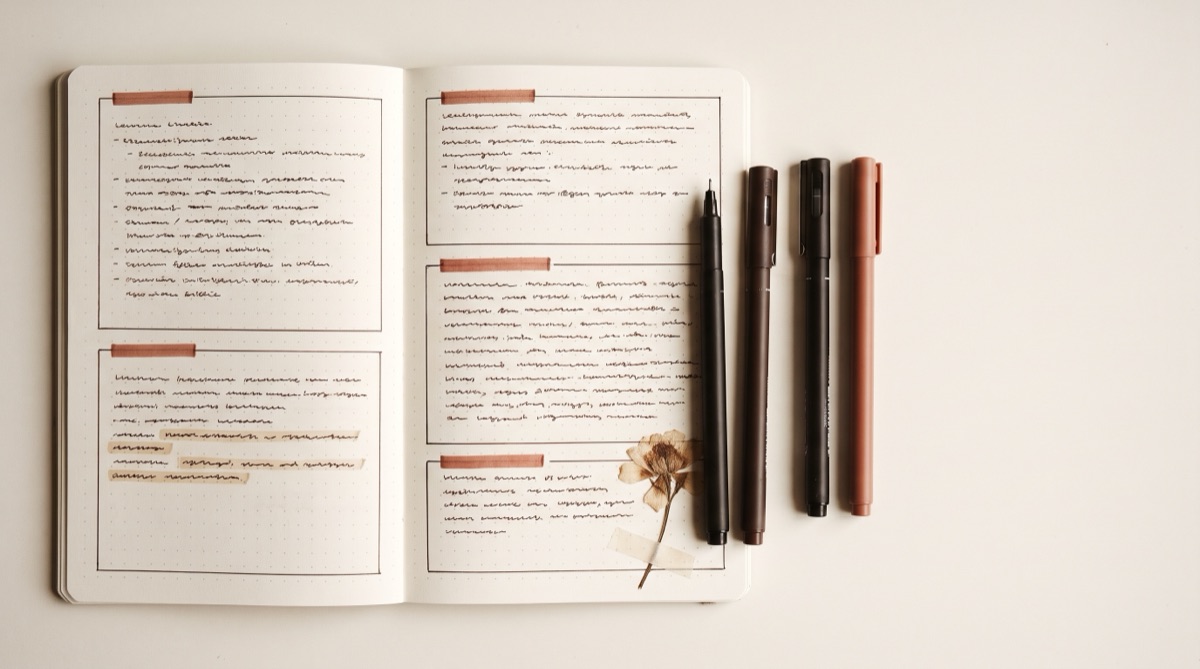
Each idea gets its own bordered box, and boxes are sized to their content rather than filling the page. This is the layout behind most of the notes you have saved to a Pinterest board. It is the most forgiving, because a box can go anywhere there is room, and the most flexible for subjects that are lots of small disconnected facts.
Timeline / flow
A single spine down the page — vertical line, arrows, dates or steps hanging off it. For history, for processes, for anything where the order is the content. Do not use it for topics without a natural sequence; you will end up inventing one and remembering it wrong.
Rule 3: three text sizes, two fonts, no more
Hierarchy comes from consistent, obvious steps in size. If your heading is only slightly bigger than your body text, it does not read as a heading, it reads as a mistake. Aim for roughly:
| Level | Relative size | Treatment |
|---|---|---|
| Page title | 2× body | Accent colour, plenty of space beneath it |
| Section heading | 1.4× body | Accent colour, underlined or with a rule under it |
| Body | 1× | Ink, tight line spacing |
| Aside / source | 0.85× | Grey, in the margin |
On paper, that means one pen for body text and a slightly thicker one for headings, plus block capitals or a simple script for titles. Digitally it means two typefaces at most: one for headings with personality, one for body text with none. Every extra font halves the effect of the others.
This hierarchy is what StudyAesthetic applies automatically — it reads your handwriting, works out which lines are headings and which are detail, and sets the whole page in a consistent scale.
Try it freeRule 4: whitespace is doing most of the work
The most common thing separating amateur pages from the ones that get reposted is that the amateur filled the paper. Leave:
- A real outer margin. Two to three centimetres, all four sides. It frames the page and gives corrections somewhere to go.
- A visible gap between sections. Roughly two blank lines. This is the single biggest legibility win available.
- The bottom third of the last page empty. That is where the summary goes once you actually understand the topic, which is never on the first pass.
If a page feels bare while you are writing it, you are doing it right. Bare on Monday is legible in May.
Rule 5: highlight about a tenth of the page
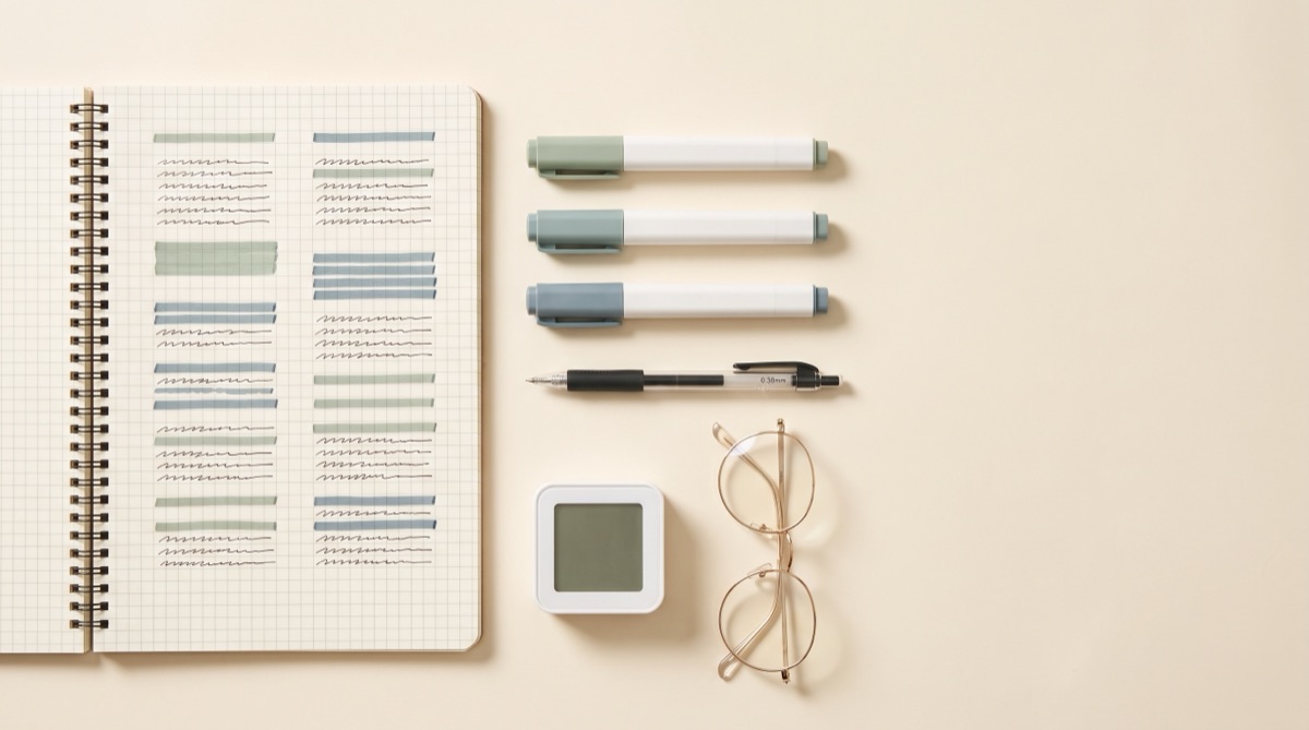
Highlighting is the most abused tool in note-taking, and there is decent evidence it does very little for recall on its own — the act is passive, and a page highlighted everywhere carries exactly as much information as a page highlighted nowhere. Treat the highlighter as a scarce resource:
- Definitions you would lose marks for paraphrasing.
- Formulas, constants, dates — anything that must be exact.
- The one line per section that, if you remembered nothing else, would let you reconstruct the rest.
That is roughly one in ten lines. Everything else you want to emphasise gets a different, quieter treatment: a margin dot, a small underline, a box. Save the colour.
Small flourishes that carry their weight
A short list, because this is where hours disappear. These are quick and they add structure rather than just decoration:
- A rule under every heading. One straight line, drawn against the edge of another notebook. Instant tidiness.
- A consistent bullet. Pick one shape and never switch mid-page.
- Margin icons. A tiny star for exam-likely, a question mark for “ask about this”, an exclamation for “I got this wrong”. Three symbols, used forever.
- Boxed formulas. A simple rectangle makes anything inside it findable when flicking.
- A date and topic in the same corner every time.Unglamorous, and the thing you will be most grateful for.
Notice what is not on that list: banners, bubble letters, washi tape borders, full-colour illustrations. They photograph beautifully and they are why “make my notes pretty” turns into a lost evening. If you enjoy them, do them on a cover page, once, not on every page of content.
Five mistakes that make notes look worse
- Copying the textbook. Transcription is not note-taking and it produces walls of text that no layout can rescue. Compress: if a paragraph does not become shorter in your notes, do not write it down.
- Rewriting notes “neatly” later. The most popular form of productive-feeling procrastination there is. Get it right once.
- Too many colours. Six highlighters is not a system, it is a rainbow. You will not remember what green meant.
- No margins. Text to the paper edge always reads as cramped, regardless of handwriting quality.
- Decorating before understanding. Beautiful notes on a topic you cannot explain are a very expensive way to feel productive.
Paper or digital?
Handwriting has a genuine, if modest, advantage for retention, mostly because it is slower and forces you to compress rather than transcribe. But it is unsearchable, it does not back up, and it cannot be reflowed when you realise the structure was wrong.
What most people land on is a hybrid: write by hand in the lecture, digitise afterwards. You keep the compression benefit of handwriting and end up with something searchable, shareable and safe from a spilt drink.
The digitising step is the tedious part, and it is the specific thing StudyAesthetic exists to remove. You photograph the page you already wrote; it reads the handwriting, works out the hierarchy, applies a consistent palette and type scale, and gives you an editable page you can export as a PDF or an image. The rules in this article are the rules it follows.
A fifteen-minute version
If you take nothing else from this, do these six things:
- Rule a margin. Two centimetres, all four sides.
- Write the topic and date in the same corner as always.
- Pick one layout from the four above.
- Body text in ink, headings in your accent, and nothing else in colour.
- Leave two blank lines between sections.
- Highlight one line per section. Stop.
That is a page that looks considered and works in May. Everything beyond it is a hobby — a good one, but be honest with yourself about which activity you are doing.
Frequently asked questions
How long should aesthetic notes take?
About the same as ordinary notes, plus five minutes. If a page is taking an hour, you have crossed from note-taking into decorating. The layout and palette are decided once per subject, not re-invented every page.
Do I need expensive pens?
No. Hierarchy, restraint and whitespace are free. If you want to buy one thing, buy a fineliner in your accent colour and one pale highlighter — around £5 total, and it covers everything in this article.
Does making notes pretty actually help you learn?
Indirectly. Decoration on its own does nothing for recall. But the structural parts — clear hierarchy, consistent colour coding, compression, whitespace — genuinely make material easier to find, review and self-test. Chase the structure and the look arrives for free.
What is the best layout for cute aesthetic notes?
Boxed or modular. Each idea gets its own bordered box sized to its content — it is forgiving, easy to rearrange, and the layout behind most of the pages people save on Pinterest. Pair it with the muted rose or sage palettes above.
Can I turn my messy handwritten notes into aesthetic ones?
Yes — that is precisely what this site does. Photograph the page and StudyAesthetic transcribes the handwriting, works out the heading structure and lays it out with a consistent palette and type scale. Your first note is free.