· 12 min read
Study aesthetic: how to build one that actually makes you study
Six study aesthetics with their palettes, the desk and digital setup behind each, and how to keep the whole thing from turning into very photogenic procrastination.
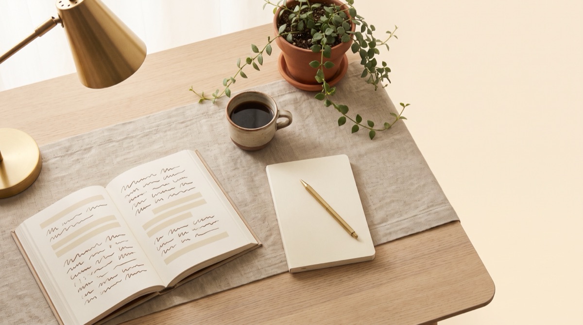
A study aesthetic is a consistent look applied to everything around your studying — the desk, the notes, the wallpaper, the playlist, sometimes the clothes. It sounds frivolous. It is, in fact, one of the more effective pieces of behavioural design available to a student, right up until the point where it quietly becomes the thing you do instead of studying.
This is how to get the first part without the second: why it works, six aesthetics with real palettes you can copy, and the honest test for whether yours is earning its keep.
Why a study aesthetic works at all
Nothing mystical is happening. Three fairly well-understood mechanisms are doing the work.
- Context as a cue. Habits are triggered by environment. A desk that only ever looks one way, and only looks that way when you work, becomes a signal that starts the behaviour with less deliberation. This is the same reason people are told not to work in bed — you do not want the sleep cue and the focus cue competing.
- Friction, redirected. Aesthetics are mostly rules about what is allowed on the surface. Rules about what is allowed on the surface are, incidentally, rules about what is within arm’s reach. A tidy desk is a low-friction start and a high-friction distraction.
- Identity. “I am the sort of person who studies at a clean desk in the morning” is a more durable motivator than willpower, because it survives days when you do not feel like it.
The six aesthetics, and what each is actually for
These are not interchangeable. Each suits a different kind of work and a different tolerance for stimulation, which matters more than which one looks best on a mood board.
1. Light academia
Cream, oat, warm brown, brass. Linen, paperbacks, natural light, a single plant. Optimistic and calm rather than gloomy. The most forgiving aesthetic to live in for long stretches, and the best default if you study for many hours at a time — nothing in it fatigues the eye.
Light academia
- Parchment
#F7F1E6· background, walls - Oat
#D9C7A9· textiles, paper - Walnut
#8A6B4A· wood, leather - Ink brown
#2E2A24· text, contrast
2. Dark academia
Deep green, oxblood, charcoal, aged gold. Lamp light rather than overheads. Genuinely good for late-night work because the low ambient contrast is easier on the eyes at 11pm than a bright white room — and genuinely bad for early mornings, when it will simply put you back to sleep. Best paired with one strong task light.
Dark academia
- Ivy black
#1E211C· background - Deep green
#3F4A38· surfaces, cloth - Oxblood
#6B2D2D· accents - Aged brass
#C7A24B· highlights
3. Korean study aesthetic
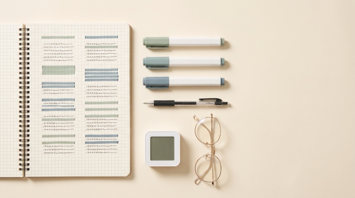
White space, muted pastels, grid paper, one accent colour, everything aligned. The most disciplined of the six and the most directly useful, because its rules are mostly about legibility. It comes with a whole working culture attached — timed sessions, visible planners, Study With Me streams — which is covered properly in the Korean study aesthetic guide.
Korean study
- Paper white
#FFFFFF· the dominant surface - Warm grey
#F2EFEA· secondary blocks - Muted sage
#A8BBA2· the single accent - Soft charcoal
#3A3A3A· text
4. Cottagecore
Botanical greens, butter yellow, dried flowers, gingham, wood. Warm and low-pressure, which makes it the kindest aesthetic for a subject you are anxious about or a term you are burnt out in. Its weakness is clutter: the look rewards accumulation, and accumulation is the enemy of a working surface. Keep the abundance on the shelves, not the desk.
Cottagecore
- Buttermilk
#FBF6E9· background - Herb green
#B7C4A0· textiles, plants - Honey
#E6B85C· accents - Driftwood
#7A6A55· wood, text
5. Scandi minimal
White, pale birch, one grey, one accent, and almost nothing on the desk. The highest-performing aesthetic for deep focus and the hardest to maintain, because it has nowhere to hide mess. If you are easily over-stimulated or you work in a small shared room, start here.
Scandi minimal
- Snow
#FAFAF8· background - Birch
#E3D9CC· wood, warmth - Stone
#9AA0A6· secondary text - Graphite
#2C2C2C· text, contrast
6. Y2K / bright
Saturated pastels, chrome, stickers, gel pens, a lot of personality. Energising and terrible for long sessions — high-stimulus environments are hard to sustain concentration in. Where it genuinely wins is short, unpleasant tasks: flashcard drilling, past-paper sprints, the twenty-minute block you have been avoiding for a fortnight.
Y2K bright
- Bubble
#FDF0FF· background - Sky
#8ED8F8· blocks - Hot pink
#FF6FA5· accents - Electric violet
#7A5CFF· highlights
The desk: five things, in this order
Every aesthetic above sits on the same functional skeleton. Get these right and the styling is the easy half.
- Light. The biggest single factor and the one most people ignore. Daylight from the side if you can — in front of you causes glare, behind you casts your own shadow onto the page. After dark, one warm task lamp on the opposite side from your writing hand.
- A clear surface. The working area should hold what you are using now and nothing else. Everything else goes in a tray, a drawer or a box that lives off the desk.
- Screen at eye level. Laptop on a stand or a stack of the textbooks you are not reading. Neck pain ends sessions earlier than boredom does.
- One texture. A desk mat, a linen runner, a wooden tray — one soft or tactile thing stops the setup reading as clinical. This is the cheapest way to make a desk look intentional.
- Something alive or handmade. A plant, a ceramic mug, a postcard. Exactly one. It is the difference between a photograph of an office and a photograph of a person’s desk.
The digital half, which people forget
You spend more of your study time looking at a screen than at your desk, so an aesthetic that stops at the edge of the wood is doing half a job.
- Wallpaper in your palette. A plain colour or a soft gradient. Not a motivational quote — you will stop seeing it inside a week.
- One folder structure, named consistently. By subject, then by topic. Boring, and it does more for calm than any wallpaper.
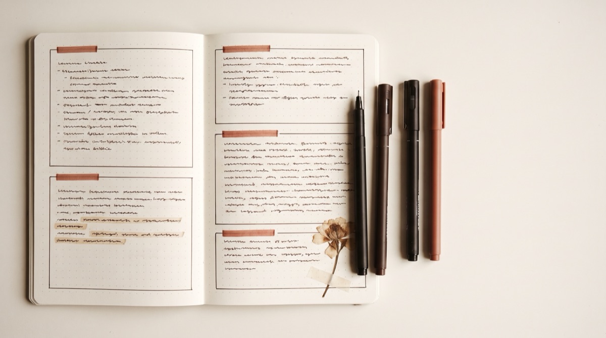
- Note templates that match. The same accent colour and heading scale in your notes as on your desk. This is the piece that makes an aesthetic feel deliberate rather than decorative.
- A browser that is not a distraction machine. A separate profile for studying, with only the tabs you need, is worth more than any app you can install.
The notes half is the fiddly bit. StudyAesthetic takes a photo of pages you have already written and returns them in a consistent palette and type scale, so your notes match the rest of your setup without you formatting anything.
Try it freeBuilding a study board without wasting a Sunday
An aesthetic study board — Pinterest, Notion, a physical pinboard — is genuinely useful as a reference, and a black hole as a hobby. Give it thirty minutes with a hard rule: it is finished when it can answer four questions.
- What are my four colours? (Hex codes, written down.)
- What does my desk look like when it is ready to work at?
- What do my notes look like — layout, heading style, accent?
- What is the routine this is wrapped around?
Anything beyond those four questions is collecting images, which is pleasant and is not setup. Save the board, close it, and do not open it again this term.
The routine the aesthetic is meant to be holding
This is the part that determines whether any of the above was worth it. A look with no routine inside it is set dressing.
- A fixed start ritual, ninety seconds long. Clear the desk, fill the water, phone in the drawer, lamp on, timer started. Same order every time. The ritual is what the aesthetic is cueing.
- Timed blocks. 25/5 if you struggle to start, 50/10 if you struggle to stop. The specific numbers matter far less than the timer being visible.
- Active work, not passive. Recall, past papers, explaining a topic aloud. Re-reading and re-highlighting feel like studying and are mostly not.
- A visible record. Hours, topics covered, or just ticks. Watching a week fill up is the actual reward mechanism in every study aesthetic on the internet.
- A shutdown. Tidy the desk to its ready state at the end. Tomorrow’s cue is tonight’s tidying.
When the aesthetic is the problem
Four warning signs, all of them common and none of them a character flaw. They just mean the tool has turned around and started using you.
- You rewrite finished notes because they do not match your new palette.
- You cannot start until the desk is perfect, so on messy days you do not start.
- You have bought stationery you have not opened.
- You know how long you studied for because you were filming it, not because you were tracking it.
The fix is not to abandon the aesthetic. It is to freeze it. Pick the palette, set the desk, and then declare the design phase over for the term. An aesthetic works because it is repeated and unremarkable, not because it is being continuously improved.
Frequently asked questions
What is a study aesthetic?
A consistent visual style applied to everything around your studying: the desk, the notes, the digital setup, often a playlist. It works by turning your environment into a reliable cue that starts the behaviour with less deliberation.
Which study aesthetic is best for focus?
Scandi minimal and Korean study, because both are low-stimulus and rule-based. Dark academia suits late nights thanks to the low ambient contrast. Bright and Y2K setups are better for short sprints than for long sessions.
How do I make an aesthetic study board?
Thirty minutes, and stop as soon as it answers four questions: your four hex codes, what a ready-to-work desk looks like, what your notes look like, and the routine it is wrapped around. Past that you are collecting images, not setting up.
Is a study aesthetic just procrastination?
It can become one. It is helping if you set it up once and then work inside it; it has turned if you are rewriting finished notes to match a new palette or cannot start until the desk is perfect. The fix is to freeze the design for the term rather than abandon it.
How do I make my notes match my study aesthetic?
Use the same accent colour and heading hierarchy on the page as on the desk, and hold to three colours with fixed roles — the method is in the guide to aesthetic notes. Or photograph pages you have already written and let StudyAesthetic apply the palette for you.