· 10 min read
The Korean study aesthetic, explained — and how to copy it
Where the Korean study aesthetic comes from, the six rules behind the look, the stationery people actually use, and how to plan a day the 열공 way.
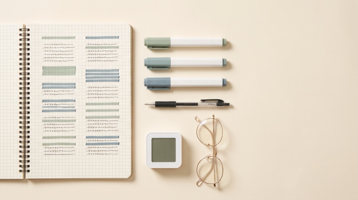
Of all the study aesthetics, the Korean one is the most rule-bound and the most obviously functional. Where dark academia is a mood and cottagecore is an atmosphere, this one is closer to a design system: white space, a grid, one accent colour, and a visible clock. It also arrives with a working culture attached, which is the part most people copying the look leave behind.
Where it comes from
The aesthetic grew out of an intensely exam-focused education system — one built around the 수능 (Suneung), the national university entrance exam, and the 학원 (hagwon) cram schools that prepare students for it. The relevant word is 열공 (yeolgong), a contraction meaning roughly “studying with burning intensity”.
Three online cultures grew on top of it, and they explain the look:
- 공스타그램 (gongstagram) — “study” plus “Instagram”. Photographs of desks, planners and timers. Because the format is a square photo, the aesthetic evolved to be legible in a square photo: high key, uncluttered, strong alignment.
- Study With Me — hours-long real-time videos of someone silently working, usually with a timer on screen. Body doubling, essentially, and the reason so much of the aesthetic is arranged to look good from a fixed camera angle.
- 스터디플래너 (study planner) — a whole stationery category dedicated to timed daily planning, where you log what you studied and for exactly how long.
Once you know it is a photo-first culture built around visible time tracking, every rule below stops looking arbitrary.
The six rules of the look
1. White is the dominant colour
Not cream, not kraft — clean white paper and a white or pale wood desk, occupying most of the frame. Everything else is a small object placed on a large field of white. This is the single biggest difference from Western study aesthetics, which tend to warm everything up.
2. One accent, used sparingly
A muted sage, dusty blue, soft clay or pale lavender — one of them, not several. It appears on the highlighter, maybe a sticky note and one object, and nowhere else. The restraint is the aesthetic.
The classic four
Pick one accent and hold to it for the whole notebook.
- Muted sage
#A8BBA2· the calm default - Dusty blue
#9FB3C8· cool, very legible - Soft clay
#D2A392· warm without being loud - Pale lavender
#B8AFD1· softest of the four
3. Grid or dot paper, always
Ruled lines are rare. Grid (모눈) and dotted paper are near-universal, because they let you align boxes, tables and headings precisely without drawing a visible frame. The grid is what makes handwritten pages look typeset.
4. Everything is boxed and aligned
Content sits in rectangles: a bordered box per concept, tables for comparisons, a ruled header strip at the top of the page. Boxes share edges with each other because the grid underneath makes that easy. The result is a page that reads like a well-organised dashboard.
5. Small, upright, even handwriting
Compact letters, consistent height, generous line spacing — small writing with a lot of air around it, rather than large writing filling the page. This is also why the paper choice matters: fine-tipped pens on grid paper reward small consistent letterforms.
6. The timer is part of the composition
A study timer sits in shot, usually top-right, showing accumulated hours. It is not decorative. Time studied is the metric this entire culture optimises, and putting the number in the photograph is the point.
The stationery people actually use
You do not need any of this — but if you are going to buy something, these are the items that recur, and why.
| Item | Why it recurs |
|---|---|
| Zebra Mildliner | Muted double-ended highlighters. The de facto standard, because the colours are pale enough to write over and photograph without glare. |
| Monami 153 / Plus Pen | Korean classics. The Plus Pen 3000 is a fine felt-tip in muted colours, ideal for small headings. |
| Muji 0.38 gel pen | Fine enough for small handwriting on grid paper without bleeding through. |
| Grid or dot notebook | The structural foundation. Iconic and Ardium are the usual Korean brands; any 5mm grid works. |
| A study planner | A daily timed planner rather than a diary — hour rows, subject blocks, a total at the bottom. |
| A study timer | A physical count-up timer, or the Forest app. Visible accumulated time is the mechanism. |
How to plan a day the Korean way
This is the working method the aesthetic is wrapped around, and it is the genuinely transferable part.
- Set a target in hours, the night before. Not “revise biology” — “biology, 3 hours”. The unit of planning is time, not task.
- Break the day into blocks on the planner page. Hour rows down the left, one subject per block, written in before you start.
- Count up, do not count down. Start the timer when you begin and stop it when you break. You are accumulating a total, not surviving a countdown — a small framing difference that makes finishing feel like earning rather than escaping.
- Shade the block in when it is done. Filling the row with your accent colour is the reward. This is the whole engine.
- Total the hours at the bottom. One number per day.
- Photograph the page. Optional, and not vanity — it is a commitment device, and it is where the aesthetic came from in the first place.
Applying it to digital notes
The look survives the move to a screen better than most aesthetics do, precisely because its rules are about structure rather than texture.
- Keep the background white. Not off-white, not a paper texture.
- One accent, applied to headings and nothing else.
- Use tables and bordered blocks generously. They are the digital equivalent of the boxed layout, and they are where the grid discipline goes.
- Increase line spacing. The airiness of the handwritten version comes from spacing, and it is the first thing lost on screen.
- Keep headings small. Distinguish them with weight and colour rather than size. Oversized headings are the most common way a digital version of this look goes wrong.
If you already write this way on paper, photograph a page and StudyAesthetic will keep the structure — boxes stay boxes, tables stay tables — in a clean single-accent layout you can edit and export.
Try it freeA note on the Study With Me habit
Worth trying even if you ignore everything else here. Working alongside a silent video of someone else working is a form of body doubling, and for a lot of people it is the difference between starting at nine and starting at noon. It costs nothing, and unlike the stationery it actually changes behaviour on the first day.
Pick a video that is longer than your intended session, put it on a second screen or in the corner of the first, and do not touch it again. The point is presence, not content.
Frequently asked questions
What is the Korean study aesthetic?
A minimal study style built on white space, grid paper, one muted accent colour, boxed layouts, small even handwriting and a visible timer. It grew out of Korea’s exam culture and the 공스타그램 and Study With Me communities.
What stationery do I need for it?
Strictly, nothing — the look comes from white space and one accent colour. If you want to buy something, a Zebra Mildliner, a 0.38mm gel pen and a 5mm grid notebook cover all of it.
What does 열공 mean?
열공 (yeolgong) is a contraction of 열심히 공부 — studying hard, or with burning intensity. It is the word the whole culture is organised around.
Why grid paper instead of lined?
A grid lets you align boxes, tables and headings on both axes without drawing a visible frame, which is what makes a handwritten page look typeset. Lined paper only controls one axis.
Does tracking study hours actually work?
It works for building the habit of starting, because accumulated time is visible and rewarding. It is a poor measure of understanding. Track hours to get to the desk; track past-paper marks to find out whether it worked. More on that balance in the study aesthetic guide.